Continuing our exploration of 17th-century maps (see my last featurette here), we look at yet another map in the Manor House:
Map of Buckinghamshire – by Danielle Straub
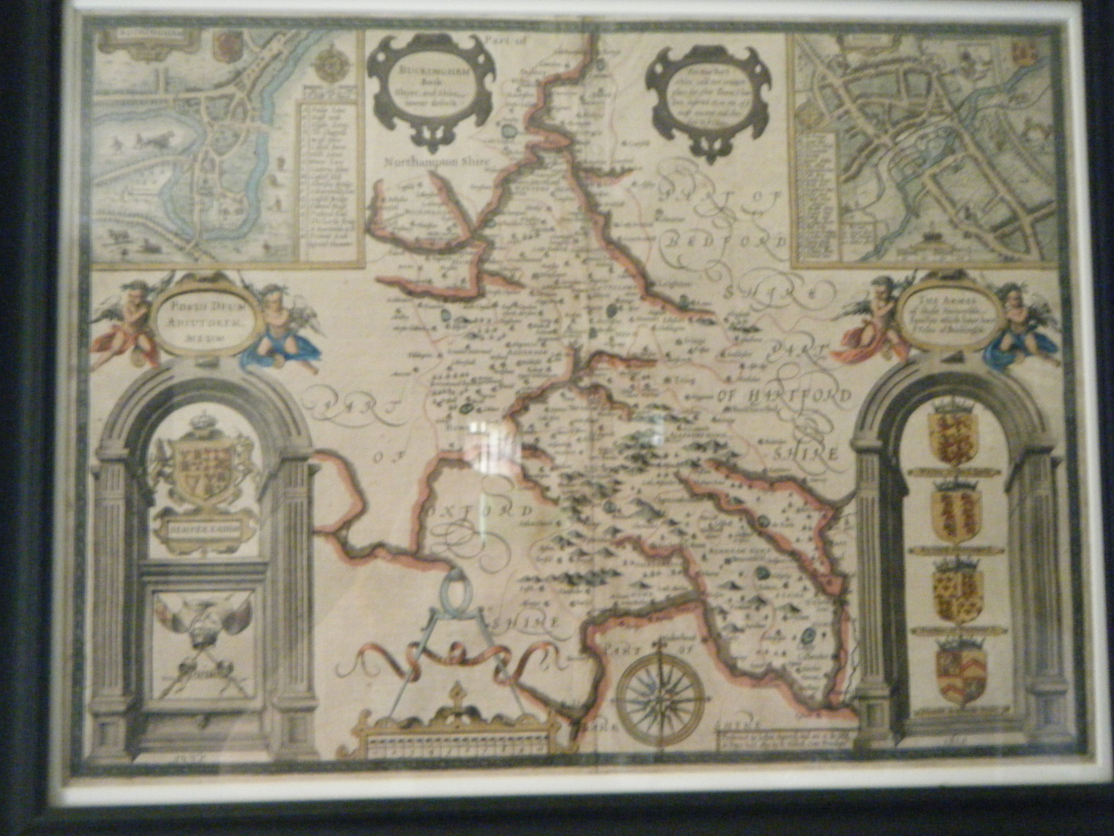
In the Manor House’s Withdrawing Room, there is a map on the far wall across from the rope. This map is small and hard to see from across the room, but up close one can see vibrant colors and beautiful ornamentation. I wanted to point this map out because not only is it beautiful, but also because it is an interesting specimen of maps from the 1600’s. Be sure and click on the images to open a larger view.
I mentioned in the last Featurette characteristics of older maps, if some may recall, which I will be using again in this article. Our map is of Buckinghamshire in England, from 1610. Since this map is 100 years older than our Pennsylvania map (also seen in the last Featurette, follow link above to view), we can see more decoration and the use of mythical creatures.
To begin, in the center of the map is the main map of Buckinghamshire. Noted on the map are man-made features such as towns, cites, and bridges. The towns and cites are marked by a symbol of small buildings with a red dot of watercolor over it. Our mapmaker seemed to use red and yellow watercolors more than the others! These colors are splashed across the crests, fleur de lis, and well-inked lions. Getting back to the central map, the natural features that we placed on the map include hills, mountains, trees, and rivers. The shape of the hills and mountains appear to be anywhere from a bump to a rounded peak, while rivers are a consistent bold line. The trees stand alone at places or are placed in clusters as well on the map.
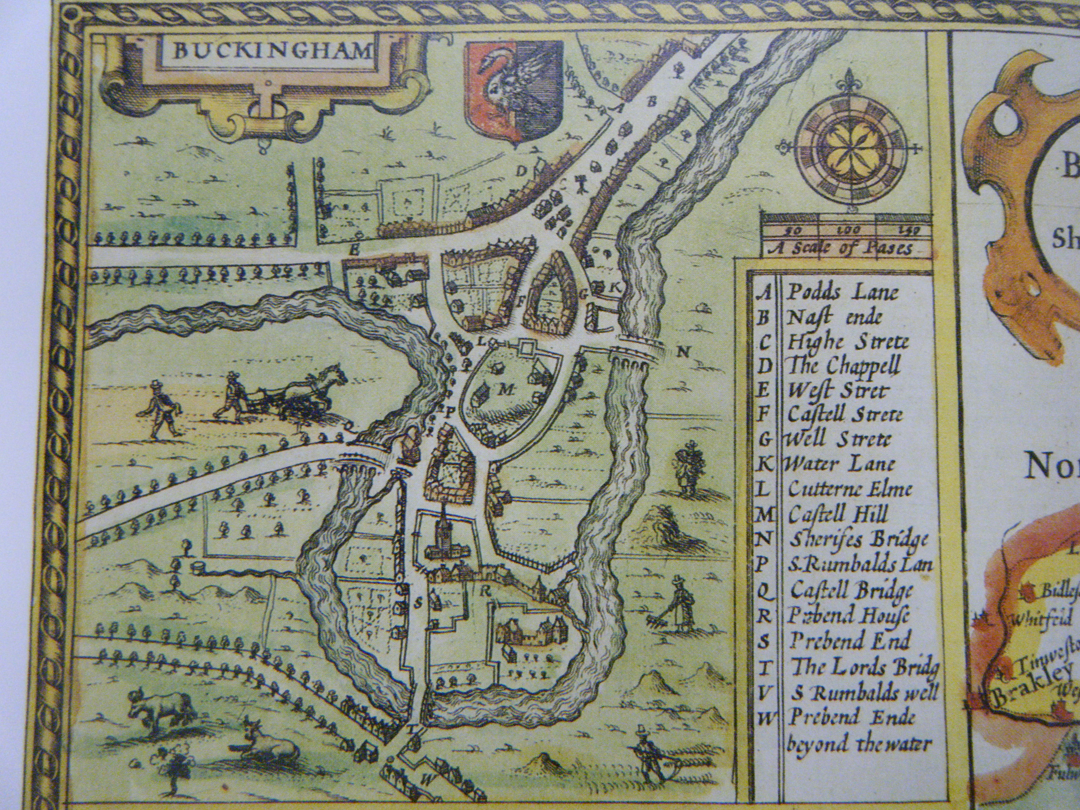
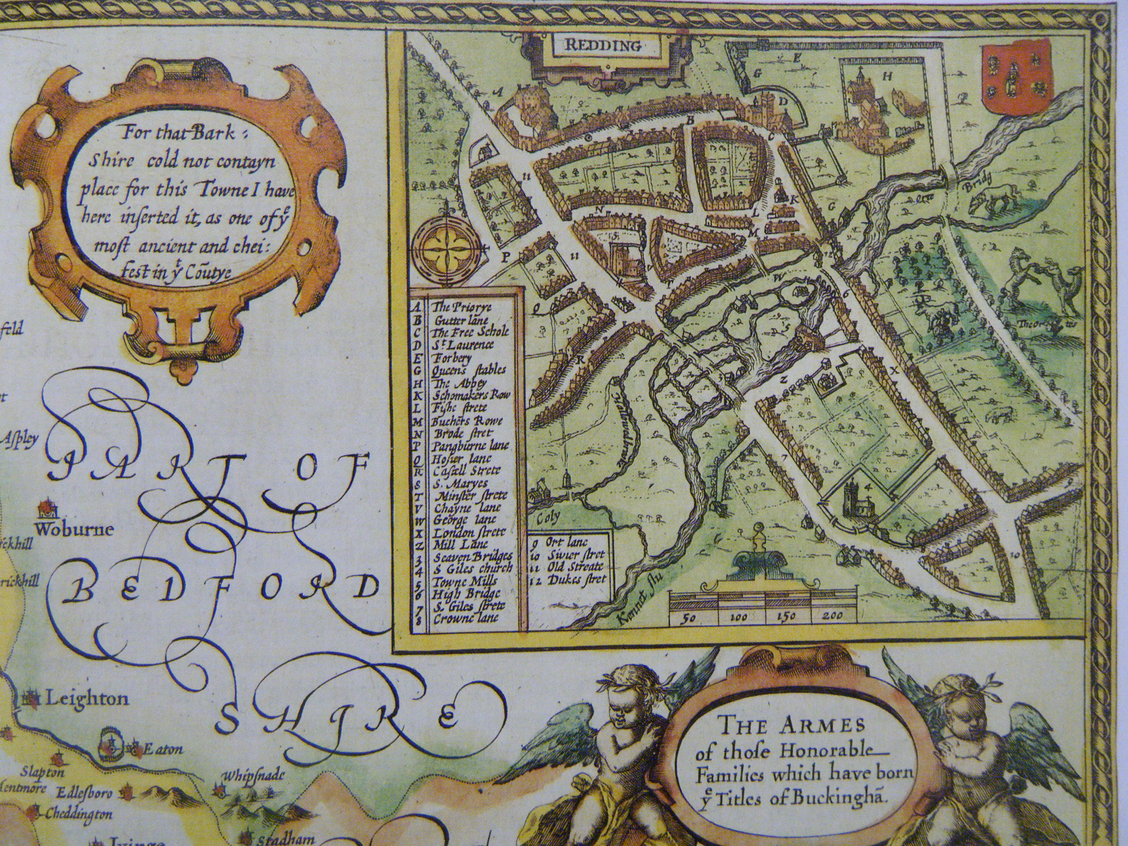
At the top corners are inset boxes. The box on the left is of Buckinghamshire and on the right is Redding. These insets are like mini maps to important cities and include their own compass, distance scale, crest, and key. They show the roads, river, groups of buildings, fields, and is decorated with oversized farmers and their animals. The key is for the street names which each have a 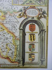
Lastly, in the bottom corners are arches. These arches have titles held up above them by two cupids. In the arch on the left is the King’s crest and below are crossed lances and flags with a crown. Across the lances is a banner which reads “UNION”. In the arch on the right are four crests with the title of “The Armes of thofe Honorable Families which have born ye Titles of Buckingha(m)”. The family crests include those of “Walter Gifford Earle, Richard Stanbowe E., Thomas of Wodftoke E., and Humfr. Stafforde Duke”. 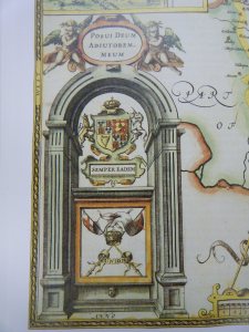
**A big THANK YOU to Danielle Straub for her work on these summer featurettes and helping our curator Todd with his work in Pennsbury’s archives!**

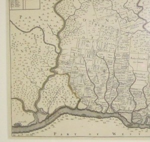
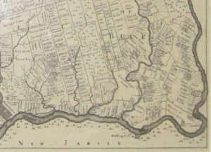
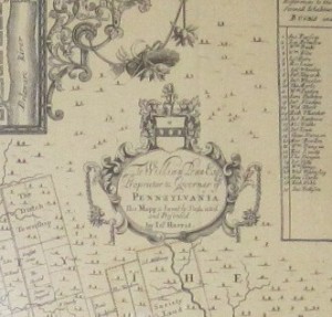
 This is, as stated on the artifact, “A MAPP OF YE IMPROVED PENSILVANIA IN AMERICA DIVIDED INTO COUNTIES TOWNSHIPS ANDLOTS. SURVEYED BY THO.HOLMES SOLD BY P.LEA. DEDICATED TO WILLIAM PENNBY INO HARRIS”. This print, shown above, is on display located in the porch of the House, above the fireplace. The map shows Philadelphia and the land along the Delaware River from New Castle to Pennsbury. It is an early 18th century map that is 26 ¼ by 20 ¾ inches in size. It is on white paper done in black printer’s ink and some watercolors.